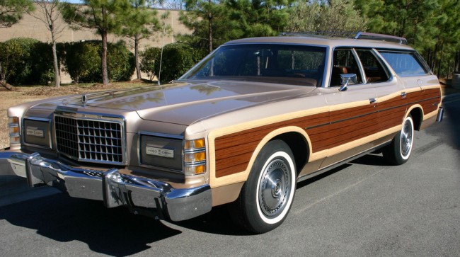
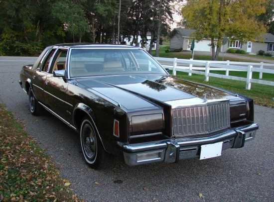
Like fashion, automobiles go through trends. Don’t swear off bellbottoms or tight jeans yet. We thought we saw the last of tail fins on cars until the new Toyota Prius emulated rear lights suggestive of a resurgence.
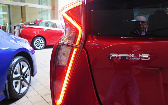
autofile.ca
Thankfully, with cars, designers like to emulate elements, not repeat old mistakes.
Were we to repeat some of the mistakes baked into car design of the 1970s, who knows what could happen to our social structure as a whole. We could slide into absolute chaos.
These ten bombs from the ‘70s are proof that we should study history as not to repeat it.
Spare Tire Humps
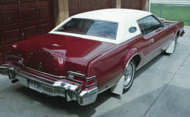
When the first cars came out, roads weren’t yet up to snuff. Having one spare for a cross country trip was like wishing for death. You had two, one on each side, maybe a third in the back. Over time, cars developed the famous spare hump. The ‘70s couldn’t resist emulating this old functional aspect of car design, but in the worst way.
Opera Windows
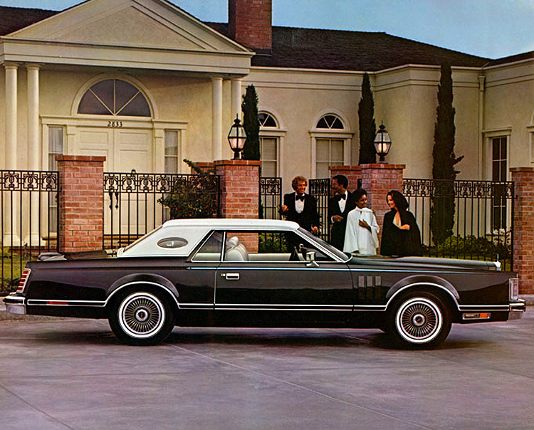
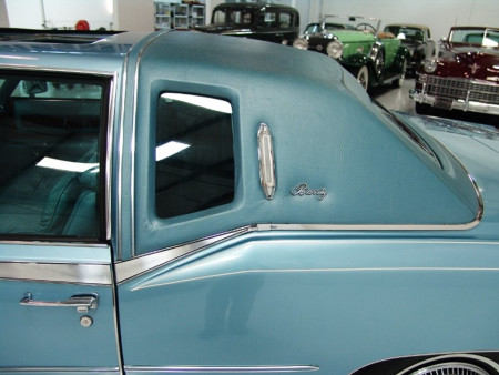
There was nothing wrong with the two-door luxury car, so long as you didn’t want to seat anyone in the back. Getting in and out of these sporty whips was not for the aging or disabled. One inside, back seat passengers could enjoy the luxury of a private opera window, so it didn’t really feel like the backseat of a coupe. Fail.
Pillow-topped Seats
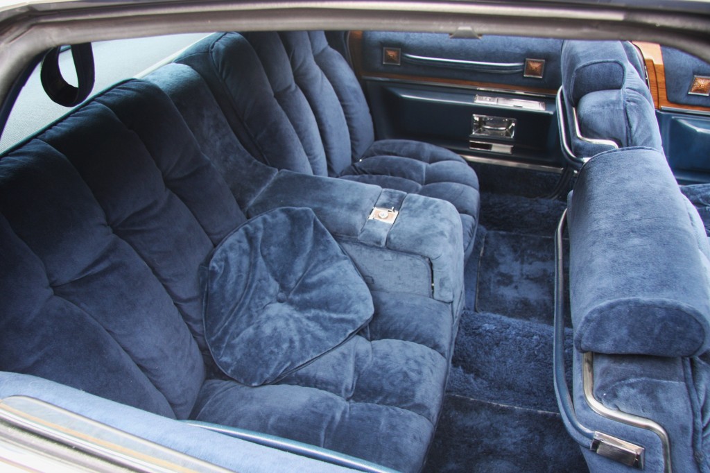
Don’t let the sound of this idea fool you. There was nothing comfy about these, not after you sat in them long enough. They not only trapped smells and spills, the foam would break down. They would tear. It didn’t take long for them to look ratty. Just, no.
Pile Carpeting
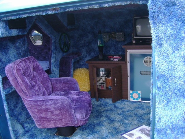
The ‘70s offered homeowners carpets in many lengths, shag being the grooviest. Then car manufacturers started putting this crap in cars. Imagine standing on a shag carpet with muddy shoes. You’d be so uncomfortable. It’s like climbing into bed wearing your dirty workbooks.
Fancy Names
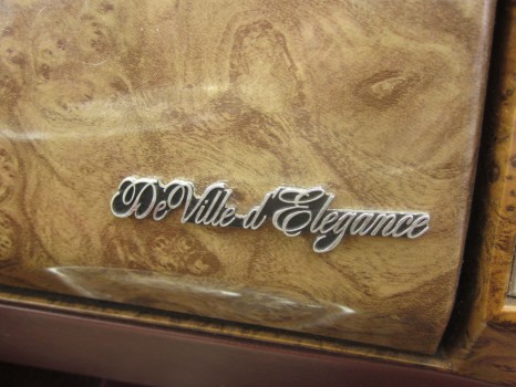
Compared to today’s simple fonts and car names, cars in the 1970s sounded like French porno. “What are you watching tonight?” “It’s called, ‘DeVille d’ Elegance.” “Oooh, sounds raunchy.” These were not French car manufacturers. We should thank our mufflers we’re past this fancy crap.
Opera Lamps
Next, to your opera window, opera lamps served the same inane concept. If we glam it up, then people will think fancy. The bulbs were often unique, hard to replace, so when they went out you left them out.
Ornamental Hood Crests
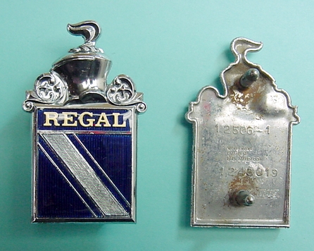
From faux royal crests to fancy animals, cars in the ‘70s were all about their hood ornaments. Everyone got in on it. Brands like Buick, and Crysler, wanted to look like the fancier manufacturers, Cadillac and Lincoln, so they designed fancy crests to go on the hoods and trunks of their cars.
Panel Vents
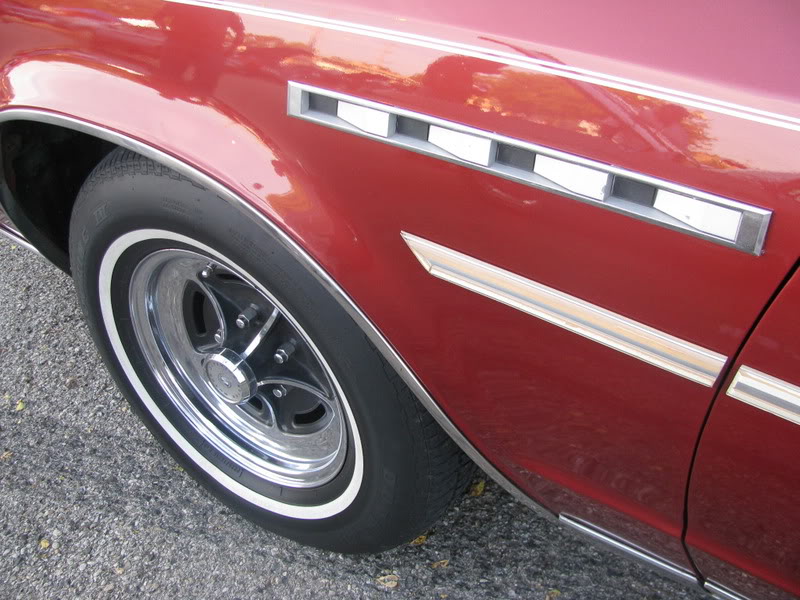
This one falls in the same category as the opera window, opera lights, and hood crests. In an effort to look fancier, manufacturers like Buick, and Chrysler, adopted the vents found on panels of their upscale siblings. The funny thing about putting fancy on not-fancy things? It makes them looks so obviously NOT fancy. BTW: Manufacturers still do this one. So sad.
Faux Wood
This one always makes me think of the fist Vacation movie. The Griswold’s station wagon rocked full wood appliqué down the sides, which Clark promptly shredded on the side of another vehicle. This gag repeated years later in Planes, Trains, And Automobiles. If your faux wood didn’t fall off from failed adhesives, it buckled and blistered from the heat of the sun.
Chromed Plastic
There is so much wrong with those two words next to each other. “Shiny and chrome” only belongs in Mad Max, not your cheap plastic car parts. I’m looking at you (again), Chrysler. After two years on any car, the chrome would peel, exposing white plastic beneath. Just dumb.

